Figuring out what to wear before a portrait session is one of the most stressful parts of the whole experience for most people.
You open your closet, stare at everything you own, and suddenly nothing feels right. You start second guessing colors, wondering if your favorite shirt photographs well, and before you know it you have tried on six outfits and you are more stressed than when you started.
We have been there with our clients enough times to know exactly how this goes. So we put together this guide to take all of that guesswork away.
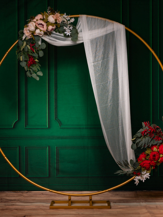
Whether you are coming in for headshots, a family session, a birthday portrait, or a creative individual session, here is everything you need to know about what to wear and how to coordinate your colors before your shooting day.
The Golden Rule: Simple Always Wins
Before we get into specifics, the most important thing to remember is this: your face is the subject of the portrait, not your clothes. Your outfit should complement you, not compete with you.
Busy patterns, large logos, and loud graphics pull the viewer's eye away from your face and your expression. A simple, well-fitting piece in a flattering color will almost always photograph better than something trendy and complicated.
Some colors love the camera. Others do not. Here is a breakdown to help you choose.
Colors We Love
Soft neutrals like ivory, cream, taupe, and warm white are timeless and photograph beautifully against almost any background. They keep the focus on your face and create a clean, elegant look.
Earth tones like terracotta, rust, camel, olive, and warm brown are incredibly flattering on most skin tones and add warmth and depth to your images without being distracting.
Muted jewel tones like dusty rose, sage green, soft navy, mauve, and slate blue add richness and personality to a portrait without overwhelming the frame.
Classic black and charcoal gray are always a safe choice for headshots and professional portraits. They are clean, authoritative, and never go out of style.
Colors to Be Careful With
Bright neon colors can be tricky because they cast a colored reflection onto your skin, especially under studio lighting. We are not saying never, but if you love a bold color, pair it with something neutral on the bottom.
Bright red can be beautiful but it is a strong color that draws attention quickly. If you want to wear red, go for a deeper burgundy or wine tone instead.
Colors to Avoid
Pure white can be tricky under studio lights because it can blow out and lose detail depending on your skin tone and the lighting setup. Opt for ivory or cream instead for a similar effect with much better results.
Still not sure what to wear?
That is completely okay. Send us a message before your session and we will help you figure it out together. That is what we are here for.
Visit brieflensstudio.com to book your session or reach out directly at contact@brieflensstudio.com. We cannot wait to work with you.
Brief Lens Studio | Buffalo, NY | @brieflensstudio